In-Depth Look at the Cloud
Your Complete Research Dashboard for Advanced Core Body Temperature Monitoring
Overview
The Calera research Cloud Platform serves as your centralized command center to view the devices associated with your account and download their data.
Key Features
- Multi-Device Access: Access multiple Calera devices from a single platform
- Real-Time Data Visualization: Access live core body temperature data and device status with automatic updates when the app is open and the device is synced via it
- Data export: Export collected data
⚠️ Haven’t created an account yet? Get started here
Interface Overview
- Dashboard: View real-time status for all connected devices & manage devices.
- Viewing Data & retrieveing data: Have an overview of the collected data & download it in a CSV file
Dashboard
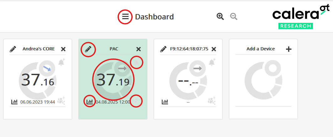
After you log in to the Calera Cloud Dashboard, the main page displays all your connected Calera devices. For each device, you can:
- View the most recent core body temperature datapoint synced via the app, clearly shown in the center of the device’s circle.
- See the device name and easily rename it by clicking the pencil icon
 .
. - Set a temperature alarm
 to receive notifications when the core body temperature reaches your chosen limit.
 - View your data by clicking on the graph icon
 .
. - Easily share device access
 for collaborative monitoring. Participants can log in to the Calera app to sync data daily, as long as Bluetooth and the internet are enabled. You will then be able to see the data they synced to your account. To prevent data loss, devices must be synced at least once per day; otherwise, older measurements could be overwritten.
Manually add a new device to your dashboard by entering its unique ID.
To add subject-specific details, click on the open three-bar icon ![]() and in User Settings.
and in User Settings.

Viewing your Data
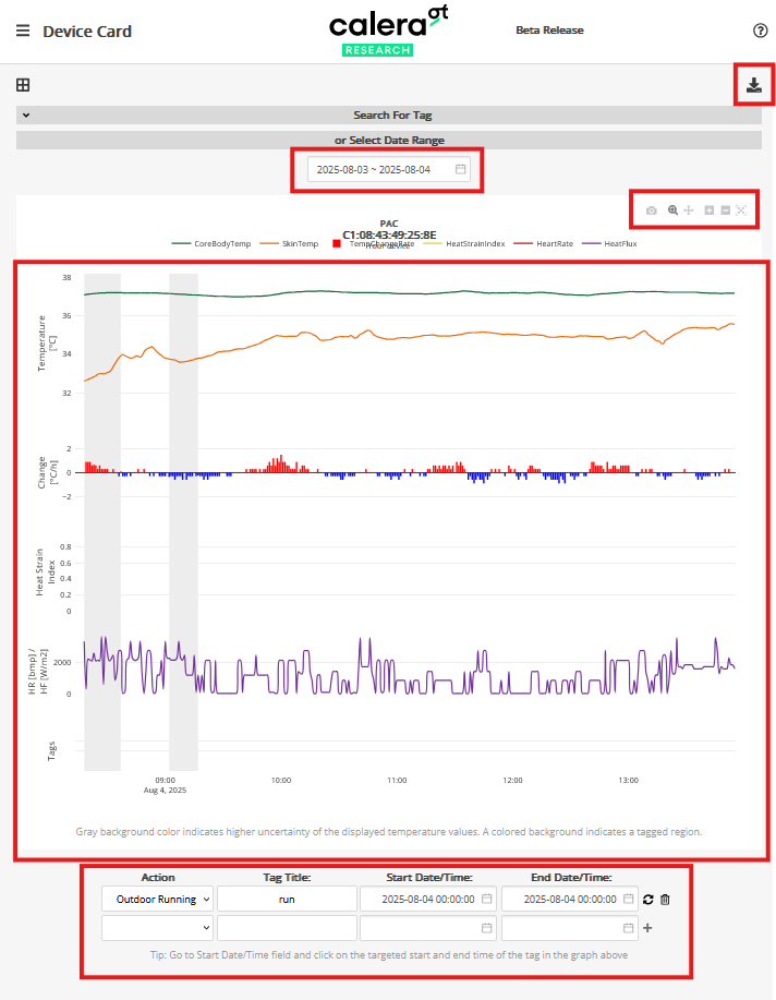
When you click on the graph icon, ![]() you will be redirected to a new window with the data on graphs.
you will be redirected to a new window with the data on graphs.
- To see your data, simply click the start date and then click the end date, this selects the time range you want to explore and download. (Dates highlighted in green are the days when your device recorded measurements).
- After selecting your dates, the dashboard will automatically display a graph showing your data between the two days you selected. It will show
- core body temperature (green line)
- skin temperature (orange line)
- temperature change rate (blue & red bar graph)
- heat strain index (yellow line)
- heat flux in (purple line)
- Learn more about the heat strain index here:
👉 What is the Heat Strain Index? - Click legend items to show or hide graph lines.
- Download the graph as a PNG

- Zoom in by selecting a time range on the graph. To zoom out, click the "Autoscale" button. You can also select an area to view by clicking and dragging.
- Tag activities for specific periods and search tags to quickly find them on the graph.
- Hover to see exact values or shift the graph to view different date ranges.

